A high-converting homepage is not a creative brief executed visually. It is a structured sequence of communication that moves a qualified visitor from first impression through confidence to action. Every section has a specific job, and the sections that underperform are the ones whose job was never defined.
The Homepage as a Conversion System
Most homepages are designed as brand showcases. They are built to create a strong impression, communicate visual quality, and introduce the business to the visitor. These are reasonable goals. They are not sufficient goals. A homepage that succeeds at impression but fails at conversion is a beautiful obstacle between the visitor and the action that generates revenue.
A high-converting homepage is a structured sequence of communication. Each section addresses a specific question a qualified visitor is asking at that point in their evaluation. The sequence mirrors the psychological journey from initial awareness through emerging interest, credibility assessment, and finally the decision to make contact. Understanding what each section is designed to accomplish is the foundation of conversion-focused homepage design.
Section 1: Navigation
Navigation is typically the first element a visitor sees, positioned at the top of the page. Its job is not to showcase every available page. Its job is to provide the clearest possible path to the pages most likely to support a conversion decision. Service pages, case studies, about, and contact are the navigation categories that carry conversion weight for most service businesses. Everything else belongs in footer navigation or accessible through internal links within content pages.
Navigation labels should use plain language that matches how visitors think about the content, not internal nomenclature the business uses. “Our Work” communicates more clearly to a first-time visitor than “Portfolio.” “Get Started” communicates more clearly than “Inquire.” The navigation is a wayfinding tool. Clarity is its primary design requirement.
Section 2: Hero
The hero section is the first content area below the navigation and typically occupies the majority of the above-the-fold viewport. Research from the Nielsen Norman Group on scrolling and attention shows that users spend more than 57% of their total page viewing time above the fold, which makes the hero section the highest-priority section on the page in terms of conversion impact.
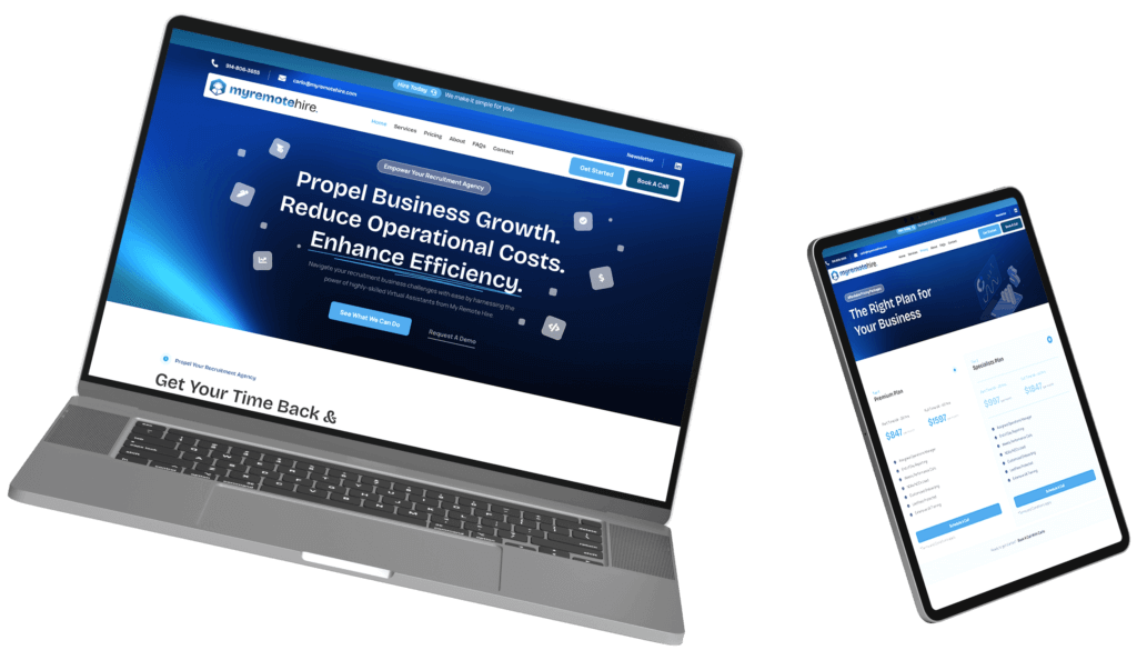
The hero section needs to accomplish four things: communicate who the business serves, communicate what the business produces for them, establish a visual and brand tone that signals credibility, and present a clear primary call-to-action. A headline that states the value proposition in specific audience-oriented language, a subheadline that adds context and scope, a primary call-to-action with specific forward-looking language, and a visual element that reinforces the message are the components of an effective hero section.
The Conte Studios approach to homepage design treats the hero as a communication problem first and a design opportunity second. The messaging strategy is defined before the visual design begins.
Section 3: Social Proof or Trust Bar
Immediately below the hero, many high-converting homepages include a trust bar: a horizontal band featuring client logos, press mentions, platform badges, review ratings, or a simple count of projects completed and clients served. This section does one thing: it confirms the initial positive impression formed in the hero section with a rapid burst of credibility evidence.
The trust bar works because it answers the implicit question every new visitor is asking: who else has trusted this business? For Conte Studios, this section references 12 years of experience, 450 completed projects, and 250 clients served alongside a 5-star Google rating and AIGA recognition. Each element is a specific, verifiable credibility signal that raises the visitor’s confidence before they have read a single service description.
Section 4: Services Overview
The services section introduces the business’s primary offerings at a high level. Its job is not to describe each service in full detail. It is to orient the visitor to the scope of the business’s work and create clear entry points into the dedicated service pages where the full description and conversion architecture live.
Each service should be presented with a name, a one-to-two sentence description that communicates the outcome it produces, and a link to the full service page. Visitors evaluating a specific service type need a direct path to the detailed information. Visitors evaluating the breadth of the business’s capabilities need a clear overview without having to navigate to multiple pages to form that picture.
The full service offering at Conte Studios covers branding and design, web development, SEO, content strategy, and the VIP Program. The homepage services section presents this scope with enough specificity to confirm relevance and enough restraint to encourage deeper exploration.
Section 5: Differentiation or Approach Statement
The differentiation section is where the business articulates what makes its approach different from the alternatives a qualified buyer is likely considering. This is not a list of values or a mission statement. It is a specific explanation of the methodology, perspective, or structural advantage that produces better outcomes for the target audience.
For a branding and web studio, this section might address the integration of strategy and design, the discovery process that precedes every project, the data-driven approach to creative decisions, or the specific experience profile of the team. Whatever the actual differentiation is, it needs to be communicated in terms of client benefit, not internal process description. The visitor is not interested in how the business operates. They are interested in what that approach means for their outcomes.
Section 6: Featured Work
The featured work section is where the homepage shifts from claims to evidence. It presents a selection of the most relevant, most impressive, or most diverse examples of the business’s output, each with enough context to communicate the strategic work behind the visual result.
For B2B service businesses, a project title and finished visual is not sufficient context. Each featured project should indicate the client type, the engagement scope, and the primary outcome achieved. This context allows qualified visitors to assess relevance to their own situation. A startup founder is more persuaded by a featured project for a startup that achieved market traction than by a generic portfolio grid without context.
The Conte Studios portfolio structures featured work with this principle in mind. The goal is for a qualified visitor to find at least one example that makes them recognize the kind of outcome they need.
Section 7: Social Proof Block
The social proof block is a more substantial credibility section than the trust bar earlier on the page. It typically features two to four client testimonials with attribution, each addressing a specific aspect of the engagement rather than offering a generic positive sentiment.
Effective testimonials for B2B service businesses address process quality, communication, timeline reliability, and outcome specificity. A testimonial that says “Conte Studios delivered a brand identity that positioned us as the premium option in our market and generated a significant increase in inbound inquiries” communicates far more than one that says “great team, highly recommend.” The specificity of the testimonial is what moves a qualified visitor from interest to confidence.
Section 8: About or Studio Introduction
The homepage about the section provides a brief introduction to the people behind the business. Its purpose is to humanize the brand and establish the expertise context that makes the service claims credible. It needs to communicate enough about the founding perspective, experience depth, and team profile to create a sense of familiarity and trust.
For Conte Studios, this section communicates Matthew Conte’s background as a CDP-certified Creative Director with AIGA recognition, the studio’s 12 years of experience, and the integrated approach that connects brand strategy, visual design, and web development. These are not generic claims. They are specific, verifiable signals that a qualified buyer can evaluate and act on, and that a well-structured brand identity and messaging framework makes consistent across every page of the site.
Section 9: Process Overview
B2B buyers evaluating a service engagement want to understand what working with the business looks like before committing to a conversation. A process overview section on the homepage addresses this need at a high level: how the business approaches new engagements, what the stages of a project look like, and what the client’s involvement typically involves.
This section reduces the perceived risk of reaching out by making the engagement model legible before contact is made. A visitor who understands the process is more likely to convert than one who is uncertain about what they are signing up for. It also pre-qualifies the relationship: visitors whose working style is not compatible with the described process self-select out, which improves the quality of inquiries that do come through.
Section 10: Final CTA Block
The page’s closing section is a dedicated call-to-action block positioned after the visitor has had the full opportunity to evaluate the business’s credentials, work, and approach. By this point in the page, a qualified visitor has formed a view about fit. The final CTA section’s job is to make it as easy as possible to act on that view.
The copy in the final CTA block should acknowledge where the visitor is in their decision process and make the next step feel low-risk and specific. “Ready to start your project? Let’s talk.” is direct and action-oriented without being pressured. “Schedule a 30-minute strategy call” sets a specific expectation. The call-to-action button language should match the framing of the copy and communicate forward motion rather than vague commitment.
Connecting with Conte Studios begins exactly this way: a focused initial conversation about the business’s goals, the current state of the brand or website, and whether there is a fit for a productive engagement. The barrier to that conversation is intentionally low because the goal is to start the right conversations, not to filter them out.
Section 11: Footer
The footer is not a conversion section but it is a navigation and credibility tool. It should provide access to secondary pages, contact information, social proof signals like review ratings, and legal elements like privacy policy. A well-organized footer confirms professional operation and gives visitors who have scrolled to the bottom of the page a final set of pathways before leaving.
Footer navigation typically surfaces pages that do not belong in the primary navigation but that visitors sometimes need: specific service sub-pages, about sub-pages, blog archives, and contact information. The footer is also where certifications, professional memberships, and platform badges are appropriately placed without cluttering the primary page sections.
The Sequence Matters as Much as the Sections
Each section of a high-converting homepage is doing specific work. But the sequence in which sections appear is equally important. The homepage is moving the visitor through a progression from initial relevance judgment through credibility evaluation to conversion confidence. Placing the process overview before the featured work, or the final CTA before the services section, disrupts this progression and reduces conversion effectiveness.
For service businesses where qualified visitors arrive with specific evaluation criteria, the sequence described above is specifically optimized for the B2B evaluation journey: trust established quickly after the hero, scope confirmed in the services section, differentiation communicated before evidence is presented, evidence validated in featured work, confidence confirmed in social proof, risk reduced through process transparency, and action invited at the moment of maximum intent. Product businesses with transactional conversion goals may sequence differently, prioritizing feature demonstration and pricing transparency earlier in the page flow.
For both contexts, the sequence is architecture. According to Baymard Institute’s research on homepage design patterns, disrupting established visual hierarchies through carousels, competing CTAs, or missequenced content blocks reduces the conversion rate of sections that would otherwise perform well in isolation.
Understanding why the sequence works is the foundation for adapting it intelligently. A high-converting homepage that has been adapted with genuine understanding of its conversion logic outperforms one that has been copied without it. Discuss how Conte Studios would structure a high-converting homepage for a specific business’s audience and conversion goals.
Frequently Asked Questions
1. How many sections should a high-converting homepage have?
There is no fixed number. A high-converting homepage has the sections required to move a qualified visitor from initial relevance judgment through credibility evaluation to conversion confidence, and no more. For most service businesses, this means eight to eleven sections as described above. Adding sections beyond what the conversion journey requires creates scroll fatigue and dilutes the impact of the sections that matter most.
2. Should every section of the homepage have a call-to-action?
Not necessarily. The hero section requires a primary call-to-action. The final CTA block requires a primary call-to-action. Secondary calls-to-action, such as links to service pages from the services section or to the portfolio from the featured work section, should appear where they naturally support the visitor’s exploration. Placing a call-to-action in every section creates visual noise and reduces the impact of the calls-to-action that matter most.
3. How often should a homepage be updated?
The homepage should be reviewed whenever the business’s service offering, positioning, or primary audience changes significantly. Beyond that, the copy, featured work, and testimonials should be refreshed annually at minimum to keep the credibility signals current. Performance data from heat mapping and analytics should drive more frequent updates to specific sections where conversion rate data indicates friction or underperformance.
4. What is the most common homepage section that underperforms?
The hero section, because it carries the most conversion weight and is most frequently treated as a visual design opportunity rather than a communication problem. The second most common underperforming section is social proof, which tends to feature generic unattributed testimonials that do not move qualified B2B buyers. Both failures trace back to the same root cause: the section’s conversion job was not defined before the design began.
5. Does the homepage need to cover every service the business offers?
The homepage services section should provide enough scope overview that a qualified visitor understands the breadth of the business’s capabilities and can identify a clear path to the specific service they need. It does not need to describe every service in full detail. That work belongs on dedicated service pages. The homepage’s job with the services section is orientation and entry-point creation, not comprehensive description.
6. How do I know if my homepage is converting effectively?
Review the conversion rate for your primary homepage call-to-action, the bounce rate, the average scroll depth, and the percentage of homepage visitors who navigate to service pages or the contact page. Heat mapping data shows where visitor attention concentrates and where it does not reach. Session recordings reveal specific friction points in the visitor journey. If your homepage conversion rate is below 2% for qualified traffic, a structured audit of each section’s performance is the starting point. The Conte Studios VIP program includes ongoing homepage performance monitoring as part of its continued client engagement.
See How the Anatomy of a High-Converting Homepage Translates Into Measurable Conversion Results
A high-converting homepage is a structured system, not a creative statement. Every section has a job, and every section needs to do it. Conte Studios designs homepages built around the specific evaluation journey of the target audience, with each section’s conversion function defined in the discovery phase before any visual design begins.
Book a free strategy call today to discuss a high-converting homepage strategy built around a specific business’s audience, service model, and conversion goals.
Key Takeaways
- A high-converting homepage is a structured sequence of communication, not a visual showcase. Each section addresses a specific question a qualified visitor is asking at that point in their evaluation journey.
- The hero section carries the most conversion weight. A specific, audience-oriented headline and a visible primary call-to-action are its minimum requirements for any high-converting homepage.
- Social proof should appear twice: as a brief trust bar immediately after the hero and as a more substantial testimonial block further down the page. Both serve different conversion functions at different stages of the evaluation journey.
- Featured work sections convert better when each project includes client context and outcome evidence rather than finished visuals alone. Qualified buyers need to see relevance to their own situation.
- The sequence of sections matters as much as the sections themselves. The homepage must move the visitor through a logical progression from relevance judgment to credibility evaluation to conversion confidence.
- The final CTA block positioned at the bottom of the page serves visitors who have evaluated the full homepage content and are at maximum intent. Its copy and framing should reflect that context and make the next step feel specific and low-risk.
- Homepage performance should be measured and iterated. Heat mapping, scroll depth, bounce rate, and conversion rate data identify which sections are doing their jobs and which are creating friction or losing qualified visitors before conversion.