
The content visitors see before scrolling plays a critical role in shaping engagement, trust, and conversion decisions. For business owners, marketers, and website teams looking to improve user experience and conversion performance, this guide explains the key elements, common mistakes, and best practices for creating a high-performing above-the-fold section that encourages visitors to take action.
Why the Fold Still Matters
An effective above the fold design can significantly influence how visitors perceive a website within seconds of arrival. The term “above the fold” originates from print newspapers, where the most important headlines and stories were placed on the upper half of the front page to capture attention at a glance. In web design, it refers to the portion of a webpage visible without scrolling.
Although modern devices vary widely in screen size, the underlying principle remains unchanged: the first content users encounter has the greatest influence on engagement. Numerous studies show that users spend a significant portion of their time interacting with content in the first viewport. If that space fails to communicate relevance or value, visitors are far more likely to leave without exploring further.
For businesses investing in web design, this area should prioritize clarity, relevance, and usability over visual complexity or stylistic experimentation. A well-structured first screen reduces friction and helps users quickly determine whether the website meets their needs.
The Five-Second Decision
Visitors form an impression within seconds of arriving on a website. During that brief moment, they are subconsciously evaluating whether the page is worth their time.
Most users are trying to answer three essential questions:
- What does this business do?
- Who is it for?
- What should I do next?
Many websites struggle because they focus on creating a visual impression rather than delivering clear answers. Generic taglines, oversized imagery, and slow-loading elements may look appealing but often fail to communicate meaningful information. This lack of clarity can lead to confusion, hesitation, and ultimately higher bounce rates.
A strong first screen removes ambiguity. It communicates value immediately, aligns with user intent, and provides a clear path forward. When visitors understand what is being offered and how it benefits them, they are far more likely to continue exploring.
Five Essential Elements of a High-Performing First Screen
A Clear, Specific Headline
The headline is typically the first piece of text visitors read, making it one of the most critical elements on the page. It should clearly communicate who you serve and the outcome you provide, leaving little room for interpretation.
Instead of broad or abstract statements such as:
“Building brands that grow businesses”
Consider a more specific and informative message:
“Brand identity and web design for startups seeking faster growth.”
Specificity helps visitors quickly determine whether they are in the right place. It also builds credibility by demonstrating a clear understanding of the audience and their needs.
A Supporting Subheadline
The subheadline works alongside the headline to provide additional context and depth. While the headline captures attention, the subheadline reinforces understanding and builds confidence.
An effective subheadline may clarify services, explain how the business operates, highlight unique advantages, or emphasize measurable outcomes. It can also address potential concerns or differentiate the business from competitors.
Rather than relying on short bullet points, a well-written subheadline can guide visitors through a concise narrative that strengthens the overall message and encourages further engagement.
A Clear Call-to-Action
Every page should include a primary action that tells visitors what to do next. Without clear direction, even interested users may hesitate or leave without taking action.
Examples include:
- Schedule a Strategy Call
- Request a Proposal
- View Our Portfolio
Specific, action-oriented language tends to perform better than vague phrases like “Get Started” because it sets clear expectations. Visitors are more likely to engage when they understand exactly what will happen after they click.
Secondary actions can be included for users who need more information before committing, but the primary call-to-action should remain visually prominent and easy to find.
A Relevant Visual
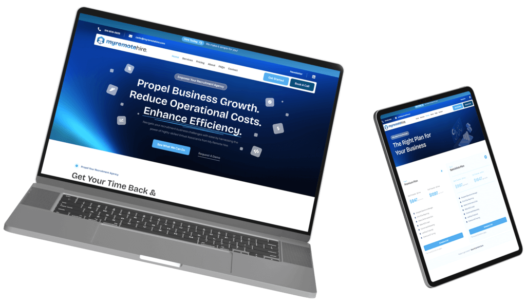
Visual elements play an important role in reinforcing the message, but they should always support the content rather than distract from it. The most effective visuals provide context, demonstrate value, or build trust.
Strong visual choices include real team photography, product demonstrations, project examples, or visuals that highlight client outcomes. These types of images help visitors better understand what the business offers and what they can expect.
In contrast, purely decorative or abstract imagery may look appealing but often fails to contribute meaningful information. When visuals align with the message, they enhance clarity and improve overall engagement.
Simple Navigation
Navigation serves as a secondary pathway for visitors who are not ready to take immediate action. It allows users to explore additional information at their own pace and find answers to specific questions.
Effective navigation should be intuitive, easy to understand, and focused on the most important pages. Overloading the menu with too many options can create decision fatigue and reduce usability.
A streamlined navigation structure helps guide users through the website in a logical way, supporting their decision-making process and improving the overall experience.
Common Design Mistakes That Reduce Conversions
Full-Screen Video Backgrounds
Video backgrounds can create a strong visual impression, but they often come with trade-offs. They can slow down page load times, distract attention from key messages, and create performance issues on mobile devices.
In many cases, a well-chosen static image paired with a clear message delivers better results by maintaining focus and improving usability.
Vague Headlines
Visitors need clarity more than creativity. While clever wording may seem appealing, it often sacrifices understanding.
If a headline could apply to almost any business, it is likely too generic. Effective headlines prioritize clarity and relevance, ensuring visitors immediately understand what is being offered.
Hidden Calls-to-Action
Users who are ready to take action should not have to search for the next step. When calls-to-action are hidden or difficult to find, opportunities for conversion are lost.
Important actions should be visible, accessible, and clearly communicated from the moment the page loads.
Rotating Carousels
Carousels attempt to display multiple messages in a limited space, but they often divide attention and reduce engagement. Research consistently shows that most users interact only with the first slide, while subsequent slides receive minimal attention.
A single, focused message is usually more effective at capturing interest and guiding users toward action.
Designing for Mobile First
Mobile devices now account for the majority of website traffic, making mobile-first design a necessity rather than an option.
On smaller screens, the visible area is significantly reduced. Visitors may only see the navigation, headline, and a portion of the supporting text before needing to scroll. This limitation makes clarity and prioritization even more important.
Mobile-first design should focus on readable typography, accessible calls-to-action, fast load times, and minimal visual clutter. Content should be structured in a way that allows users to quickly understand the message without excessive scrolling or effort.
Designing with mobile in mind often leads to cleaner, more focused layouts that translate effectively to larger screens.
Measuring and Improving Performance
The most effective websites treat design decisions as ongoing experiments rather than fixed solutions. Continuous testing and refinement allow businesses to improve performance over time.
Common optimization methods include testing different headlines, experimenting with call-to-action language, comparing visual elements, and analyzing user behavior through tools like heatmaps and session recordings.
When evaluating performance, it is important to consider multiple metrics together. Bounce rate, scroll depth, and conversion rate each provide valuable insights, but no single metric tells the full story.
A change that improves one metric while negatively impacting another may not represent a true improvement. The goal is to create a balanced experience that supports both engagement and conversion.
Over time, even small improvements in the first screen can lead to significant gains in overall performance.
How Strong Above the Fold Design Improves Conversions
A strong first screen influences every interaction that follows, making above the fold design a critical factor in user engagement. When visitors immediately understand what a business offers, who it serves, and what action to take next, they are more likely to stay engaged and move through the conversion journey. Clear messaging, relevant visuals, intuitive navigation, and visible calls-to-action all contribute to stronger performance over time.
If the current above the fold design is not communicating value within seconds, the solution is often a strategic redesign rather than a simple visual refresh. Conte Studios applies this conversion-focused approach to every homepage and landing page, helping businesses create experiences that support engagement, trust, and long-term growth.
Frequently Asked Questions
- What does “above the fold” mean in web design?
It refers to the portion of a webpage visible without scrolling. Since it is the first content visitors see, it plays a major role in engagement and conversion decisions.
- How important is above-the-fold content?
Research shows users spend a large portion of their viewing time in the first screen. This section must communicate value clearly and encourage visitors to continue exploring.
- What is the most important element above the fold?
The headline. It should quickly explain what the business offers, who it serves, and why visitors should stay on the page.
- Should there be more than one call-to-action?
A primary call-to-action should always be visible. A secondary option can be included, but the primary action should remain the most prominent.
- Do rotating carousels improve conversions?
Generally, no. Carousels often divide attention and reduce engagement. A single focused message typically performs better.
- How does mobile design affect the fold?
Mobile screens display less content, making clear headlines, concise messaging, and visible calls-to-action even more important for user engagement.
Create a First Impression That Drives Action
The first screen of your website has a direct impact on engagement, trust, and conversions. Conte Studios designs homepage and landing page experiences that communicate value clearly, guide visitors toward action, and support long-term business growth.
Book a strategy call to discuss how a conversion-focused approach can improve your website’s performance from the very first interaction.
Key Takeaways
- The content visible before scrolling has a major impact on engagement and conversion rates.
- Visitors should quickly understand what the business does, who it serves, and what action to take next.
- Clear, specific headlines generally outperform broad or aspirational messaging.
- Strong calls-to-action should be visible immediately and communicate the next step clearly.
- Common conversion killers include vague headlines, video backgrounds, and rotating carousels.
- Regular testing of headlines, visuals, and calls-to-action helps improve performance over time.