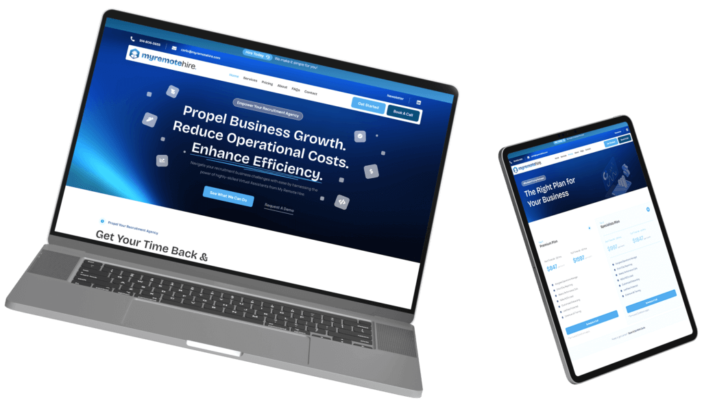
In today’s fast-paced digital world, it is essential to optimize your website for mobile devices. With the ever-increasing number of mobile users, neglecting mobile usability can lead to missed opportunities and decreased engagement. In this curated guide, we will walk you through the process of performing a comprehensive mobile website audit for your site. So, let’s dive in and discover how to unleash the power of your website on mobile platforms!
Understanding the Basics of Mobile Usability
Before we begin, let’s ensure we are on the same page when it comes to mobile usability. Mobile usability refers to the ease and effectiveness with which users can interact with your website on mobile devices. Seamless user experience on mobile devices involves several key factors, including responsive web design, loading speed, readability, touch-friendly elements, and intuitive navigation. Each of these elements contributes to creating a mobile-friendly environment that keeps users engaged and satisfied.
Analyzing Mobile Traffic and User Behavior
Your first step in conducting a mobile site audit is to gather crucial data related to mobile traffic and user behavior. Leveraging analytical tools like Google Analytics allows you to gain insights into mobile usage trends. By studying peak hours, popular pages, bounce rates, and user interaction patterns on mobile devices, you can identify areas for improvement and devise strategies to provide a better user experience.
Testing Website Responsiveness
A major aspect of mobile usability is ensuring that your website is responsive across different devices and screen sizes. Testing the responsiveness of your website is key to identifying any issues that may hinder mobile user experience. Utilize tools like Google’s Mobile-Friendly Test, Responsinator, or browser developer tools to check how your website adapts to different screen resolutions and orientations. This forms a core part of your mobile website audit. Make adjustments to your layout, font sizes, and media elements to ensure optimal viewing across all devices.
Assessing Loading Speed
Nowadays, users expect websites to load quickly, especially when browsing on their mobile devices. Loading speed plays a crucial role in minimizing bounce rates and improving user experience. Tools like Google’s PageSpeed Insights and GTmetrix enable you to evaluate your website’s loading speed and identify areas that need optimization. Running a mobile pagespeed test helps highlight performance gaps on mobile. Consider techniques such as reducing image sizes, leveraging browser caching, and removing unnecessary code to enhance your website’s loading speed and deliver a snappy experience to your mobile users.
Optimizing Readability and User Engagement
Ensuring that your content is easy to read on smaller screens is paramount. Adjusting font sizes, typography, and line spacing promotes readability and keeps users engaged. Remember to implement readable font sizes, choose clear typography, and maintain appropriate line spacing. Additionally, focus on user engagement by incorporating clear call-to-actions, mobile-friendly forms, and user-friendly buttons. By optimizing readability and user engagement, you create a pleasant browsing experience that encourages users to stay longer on your website — a key objective in any mobile site audit.
Evaluating Touch-Friendly Elements
Interactions on mobile devices differ significantly from desktop interactions, primarily due to touchscreens. Therefore, assessing and improving touch-friendliness is crucial to providing a superior user experience on mobile. By increasing button sizes, providing ample spacing between elements, and avoiding dropdown menus, you can enhance the touch-friendliness of your website. Moreover, ensure that your design incorporates proper feedback and visual cues to guide users effectively, maximizing engagement and streamlining interactions — all vital aspects of a thorough mobile website audit.
Enhancing Mobile Navigation
Navigation is a vital component of the user experience, especially on mobile devices where screen real estate is limited. Simplifying navigation on mobile devices is key to helping users find what they need quickly and effortlessly. Implement intuitive navigation menus and consider sticky headers to enable easy access to important sections of your website. Additionally, optimize your search functionality to offer a seamless mobile user experience, allowing users to find information efficiently. These improvements often surface during a proper mobile site audit.
Congratulations on completing your mobile usability audit! By following this step-by-step guide, you have equipped yourself with the knowledge and tools needed to improve the mobile experience of your website. Remember, mobile usability continues to evolve, so monitoring and optimizing your website on an ongoing basis is essential. Whether through regular mobile pagespeed tests or design improvements from your mobile website audit, prioritizing mobile user experience gives you a competitive advantage in the digital landscape, enabling you to reach a wider audience and increase engagement. So go ahead, unleash the power of your website on mobile platforms, and pave the way for a remarkable user experience!
Ready to Optimise Your Mobile Experience?
Don’t let slow speeds or poor mobile design hurt your brand. Get a free mobile site audit and see how your website performs on mobile — and what’s holding it back.

