
User-friendly website features are not just about making navigation easy. They are the design and technical decisions that reduce friction at every stage of the visitor journey, from first impression to committed inquiry. This guide covers the features that matter most for business websites built to convert, not just to inform.
What Makes a Website Truly User-Friendly
User-friendliness is often described as an intuitive quality. A site either feels easy or it does not. But behind that feeling are specific design and technical decisions that either support or undermine the visitor’s ability to get what they came for quickly and confidently. Understanding which user-friendly website features drive that experience makes the difference between a site that performs and one that simply exists.
For business websites, user-friendliness is a conversion concern first. A site that is pleasant to use but fails to guide visitors toward a decision is not serving its business purpose. The features that matter most are the ones that reduce friction, communicate trust, and create clear paths from interest to action.
At Conte Studios, every website we build is structured around the visitor’s decision-making process. Every feature serves a function, and every function serves a conversion.
Core Navigation Features
Clear, Minimal Primary Navigation
The primary navigation menu is the map of your entire website. It should contain the destinations that matter most to a first-time visitor making a decision about your business. Limit your primary menu to five to seven items. Use direct, descriptive labels that tell visitors exactly what they will find. Avoid jargon, creative naming conventions, or labels that require familiarity with your brand to understand.
Dropdown menus should be used only when genuinely necessary and designed to be scannable, not overwhelming. A visitor who cannot navigate your site efficiently within the first ten seconds is unlikely to persist long enough to convert.
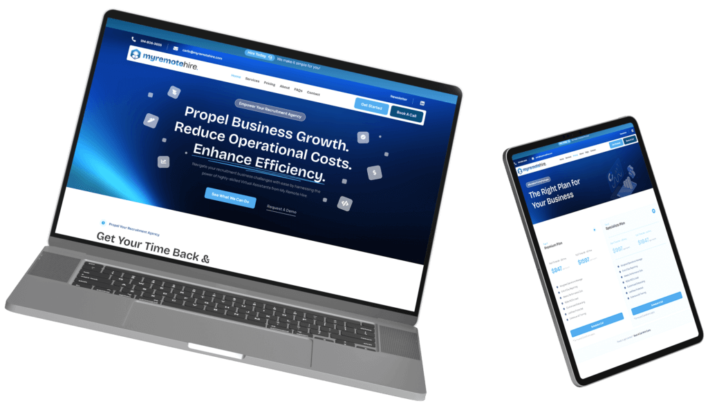
Sticky Header Navigation
A sticky header that remains visible as users scroll down long pages is one of the highest-value user-friendly website features for conversion. It keeps your primary navigation and call to action accessible at all times, so a visitor who reaches the bottom of a detailed service page does not have to scroll back to the top to take action. The difference between a scrolling header and a sticky one is the difference between friction and flow in the conversion path.
Breadcrumb Navigation on Deep Pages
For sites with multiple levels of content depth, breadcrumb navigation helps users understand where they are in the site architecture and return to previous levels without using the browser’s back button. Breadcrumbs also provide structural SEO benefits by creating additional internal linking that communicates page hierarchy to search engines.
Performance Features That Define User Experience
Fast, Consistent Load Speed
Load speed is the most fundamental user-friendly website feature. Every other element on this list is rendered irrelevant if the page takes so long to load that users abandon it first. Fast performance requires a combination of compressed images, efficient code, minimal render-blocking scripts, and a hosting infrastructure designed for speed.
If your hosting environment is not optimized for performance, page speed issues will persist regardless of how well the design itself is built. Infrastructure and design must work together.
Mobile-First Responsive Design
Responsive design that adapts gracefully to every screen size is not optional for a modern business website. Mobile-first design means the site is built for small screens first, with the desktop experience built on top of that foundation. The result is a layout that works correctly and comfortably on the devices that most of your visitors actually use.
Key markers of strong mobile design include touch-friendly tap targets, readable font sizes without zooming, navigation designed for thumb reach, and content that reflows correctly in portrait and landscape orientations.
Content Clarity Features
Descriptive, Specific Headlines
Headlines are the most scanned element on any page. They determine whether a visitor concludes that the content is relevant to them within the first few seconds. Generic headlines like “Welcome to Our Website” or “We Help Businesses Grow” communicate almost nothing. Specific headlines that describe the concrete value being offered and the audience it serves set the right expectation and hold attention.
Visible and Logical Heading Hierarchy
A clear heading hierarchy using H1, H2, and H3 levels creates a scannable structure that allows visitors to navigate long-form content efficiently. Most visitors scan a page before deciding whether to read it in depth. A well-organized heading structure rewards that scanning behavior and guides readers toward the sections most relevant to their specific question or need.
Short, Purposeful Paragraphs
Dense blocks of text are a common readability problem on business websites. Short paragraphs of three to four sentences with clear transitions between ideas reduce cognitive load and sustain reading engagement. Each paragraph should advance a single idea. If a paragraph is doing two jobs, it should be two paragraphs.
Strategic Use of Visual Content
Relevant images, diagrams, and video content used at the right moments in the content flow increase time on page and comprehension. Visual content should illustrate or reinforce the point being made in the adjacent copy. It should not be a decorative filler. Our content strategy approach treats visual and written content as a single integrated system, not two separate tracks.
Trust and Credibility Features
Social Proof Positioned Near Conversion Points
Testimonials, client logos, review scores, and case study summaries are most effective when placed near the moments of decision in the conversion path, not siloed on a separate testimonials page that most visitors never visit. A testimonial placed directly above a call-to-action button provides the last trust signal a hesitant prospect needs before committing.
Review our client results to see how outcome-focused social proof is integrated into a site architecture that serves conversion, not just reputation.
Transparent Pricing or Clear Engagement Path
Visitors who cannot quickly determine whether your services are within their consideration set will leave without inquiring. Transparent pricing or a clearly described engagement process reduces the uncertainty that creates hesitation. If your pricing varies by project scope, explaining the factors that influence cost gives potential clients enough context to self-qualify before reaching out.
Authentic Team and Brand Presentation
Business buyers are making decisions about people as much as services. Photography of real team members, descriptions of the people behind the work, and an honest representation of your studio’s personality all contribute to the trust that converts a curious visitor into a committed prospect. Generic stock photography in place of authentic imagery is one of the most consistent ways business websites undermine the trust they are trying to build.
Conversion-Focused Features
Prominent, Specific Calls to Action
Every page should contain a primary call to action that is visually prominent, specifically worded, and logically positioned at the moment the visitor is most likely to be ready to act. Button copy like “Book a Strategy Call” or “See Our Work” is significantly more effective than generic labels like “Click Here” or “Contact Us.” Specificity reduces friction by setting a clear expectation of what happens next.
Frictionless Contact and Booking Forms
A contact or booking form that asks for only the information genuinely needed converts at a significantly higher rate than one that requests excessive detail upfront. Each additional field adds friction. Start with the minimum required to open a qualified conversation and gather additional information through that conversation rather than before it. Your book a call page and contact form should be designed around this principle.
Clear Next Steps After Form Submission
A thank-you or confirmation page after form submission sets expectations for what happens next and signals to the visitor that their inquiry was received. This is a commonly overlooked conversion feature. The visitor who submits a form but receives no confirmation of receipt is left uncertain. That uncertainty reduces confidence in the business before the first conversation has even happened.
For businesses that want every one of these features built into a continuous creative and optimization system, the VIP Program from Conte Studios provides ongoing design, development, and content support as an integrated studio partnership.
Accessibility Features
Accessibility is both an ethical responsibility and a user-experience standard. Features like sufficient color contrast ratios, keyboard navigable menus, descriptive image alt text, clearly labeled form fields, and focus indicators for interactive elements serve users with disabilities and improve the experience for all users on all devices.
According to the World Wide Web Consortium, approximately one billion people globally experience some form of disability that affects how they use the web. Designing with accessibility as a standard, not an afterthought, expands your effective audience and reduces the legal risk associated with inaccessible digital properties.
According to WebAIM, over 95 percent of the top one million web pages have detectable accessibility failures. Addressing these issues is both the right thing to do and a genuine competitive differentiator.
Site Search and Wayfinding
For content-rich sites with multiple service areas, product categories, or resource libraries, a functional site search feature dramatically improves user experience. When visitors cannot find what they are looking for through navigation alone, search provides an immediate alternative path. Leaving visitors without a search option on large sites creates frustration and increases exit rates.
Complement site search with a well-structured portfolio section and resource library so that visitors exploring your capabilities have multiple discovery paths available beyond the primary navigation.
Frequently Asked Questions
1. What are the most important user-friendly website features for a small business?
For small businesses, the highest-priority user-friendly features are fast mobile load speed, clear primary navigation, specific calls to action on every key page, a friction-minimized contact or booking form, and social proof positioned near conversion points. These features directly affect whether a first-time visitor becomes a lead, which is the primary job of a small business website.
2. How does user-friendliness affect SEO?
User-friendliness directly affects several of Google’s core ranking signals. Page speed, mobile usability, and engagement metrics including time on page, scroll depth, and conversion rate all influence how search engines evaluate the quality of a page’s experience. A user-friendly site that holds visitors longer and generates higher engagement rates will outperform a less friendly site on SEO over time, even with equivalent content.
3. How many calls to action should a page have?
Most pages benefit from one primary call to action and one secondary option. The primary CTA should reflect the page’s main conversion goal. A secondary option gives visitors an alternative action for those who are not yet ready for the primary commitment. Offering more than two competing calls to action creates decision paralysis and typically reduces conversion across all options.
4. Should I prioritize desktop or mobile when designing for user-friendliness?
Design for mobile first and scale up to desktop. The majority of web traffic arrives on mobile, and designing the core experience for mobile ensures it works for the largest segment of your audience. A mobile-first design adapted for desktop almost always produces a better experience on both platforms than a desktop design forced into a smaller layout.
5. What is the biggest mistake businesses make with their website navigation?
The most common navigation mistake is including too many items in the primary menu. When every page competes for navigation real estate, the menu stops communicating hierarchy and starts communicating chaos. Limit primary navigation to the destinations a first-time prospect actually needs to evaluate whether your business is the right fit.
6. How often should user-friendly features be reviewed and updated?
Core user-experience features should be reviewed at least annually against current traffic data, conversion rates, and usability standards. Specific triggers for a more immediate review include a measurable drop in conversion rate, a significant change in your audience or service offering, a platform or CMS update, or new accessibility standards taking effect.
Build a Website That Works as Hard as You Do.
Conte Studios builds user-friendly websites that convert visitors into clients from day one. Every feature, every decision, every page is built for outcomes.
Book a strategy call, let’s talk about what your brand needs next.
Key Takeaways
- User-friendly website features are conversion tools, not just usability improvements.
- Primary navigation should contain no more than five to seven items with clear, direct labels that require no prior knowledge of the brand to understand.
- A sticky header keeps your call to action accessible throughout long-form page scrolling, which meaningfully improves conversion rates.
- Page speed is the foundational user-friendly feature. Every other design decision is undermined if the site loads slowly.
- Social proof is most effective when positioned near conversion points, not on a separate page that requires deliberate navigation to find.
- Contact and booking forms should request only the minimum information needed to open a qualified conversation.
- Accessibility features serve a global audience of over one billion users and improve the experience for all visitors, not just those with disabilities.
- Each page should have one primary call to action with specific copy that sets a clear expectation for what happens next.